
A logo is there to establish trust, brand recognition, and your company’s identity. It’s there to show credibility and professionalism. The logo helps you in your marketing efforts, making your brand all the more visible to the audience. Most of all, it attracts new clients.
However, the logo needs to be expertly designed with specific goals in mind, so it can efficiently fit most real estate marketing materials you end up making. To inspire you and give you some suggestions, we’ve prepared a list of some of the best real estate logos on the market.
1. Berkshire Hathaway
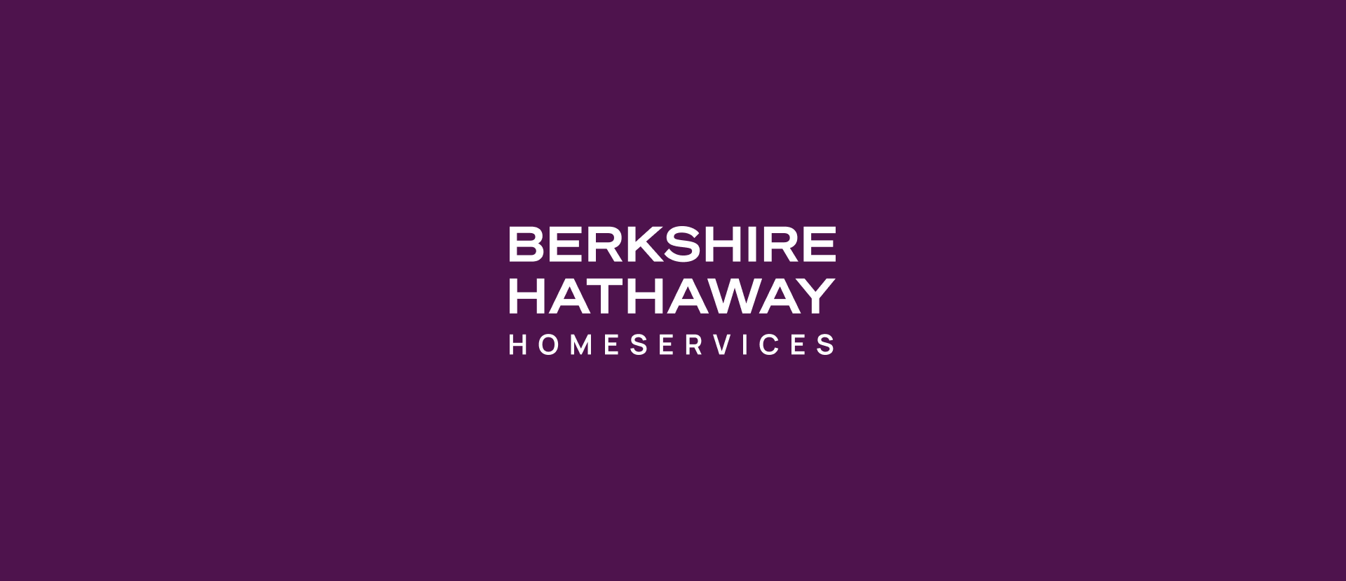
The Berkshire Hathaway HomeServices California Properties logo only uses the brand name in different fonts, which is more than enough.
At the very top, in bolded letters, is the name Berkshire Hathaway, which we are very familiar with, followed by HomeServices in slightly less prominent letters, indicating that the company relies on the famous Berkshire Hathaway brand. The line below is there to separate the specific entity of the larger company and its location, indicated by the California Properties wordmark, so you know exactly what you’re dealing with.
The whole logo is designed with professionalism in mind, exactly what BH HomeServices always aims to portray in its marketing efforts.
2. Century 21
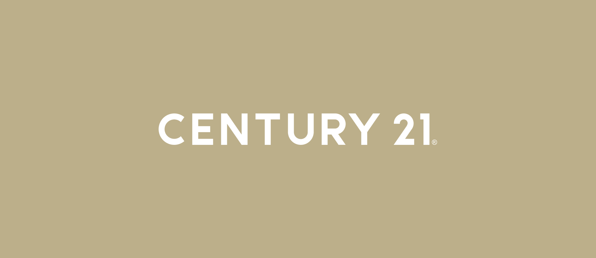
The Century 21 logo is just a wordmark, or the company name, with its distinct “Relentless Gold” color.
The name is the brand, and this company doesn’t need more to convey its quality and expertise. However, it’s still very clean and modern, ensuring the brand goes with the time. The signature gold color is there to signify prestige, quality, success, and value.
3. Ebby Halliday
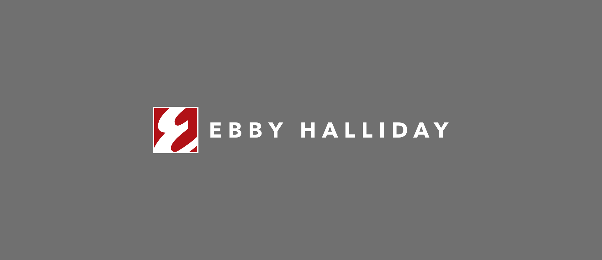
Ebby Halliday features its signature E letter on a red background for the logo, often accompanied by the company name.
The name of the company is the name of its esteemed founder, and it has always been the main part of the logo. The logo is still very distinctive and yet simplistic, but that’s precisely what makes it memorable.
4. Long & Foster
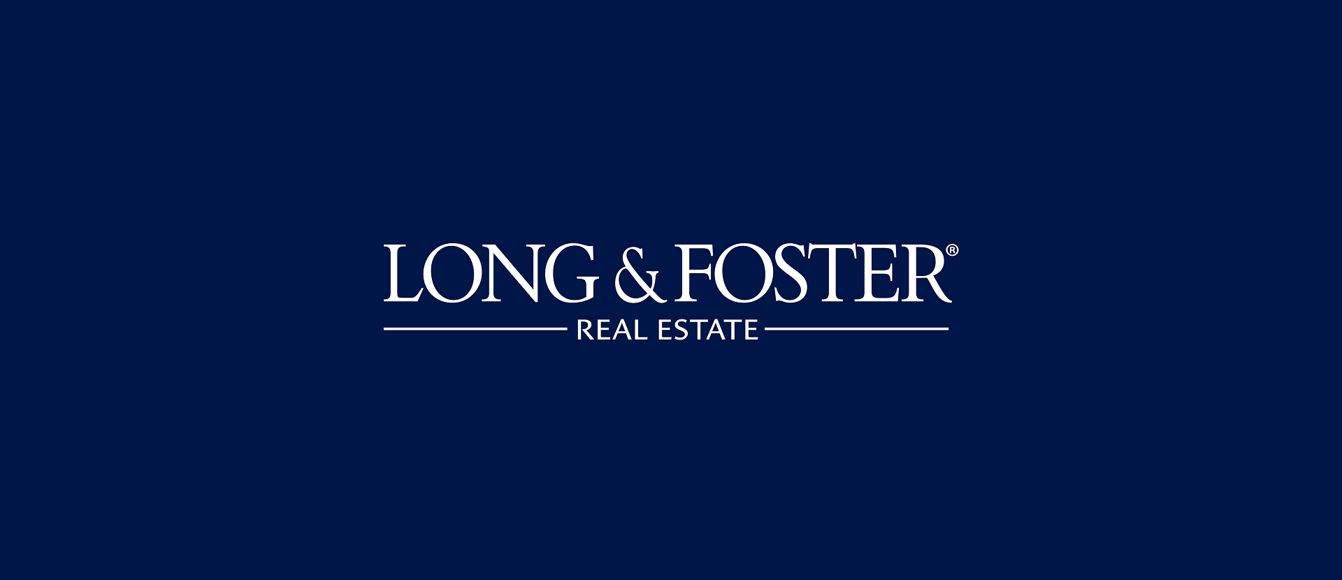
The logo of Long & Foster is the name of the company in a classic serif font, together with Real Estate below, and a dark navy blue surrounding it.
The logo is very clean, professional, and distinctive. It portrays tradition and reliability, something a real estate firm should always convey. Interestingly, the logo utilizes added words that are there to clearly connect it to the industry it’s a part of, which makes it immediately clear what this company offers for those who don’t know it.
5. Marcus & Millichap
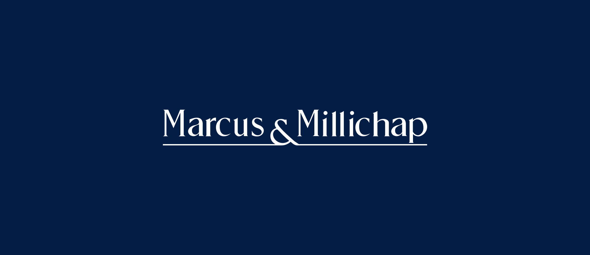
Like most of the best real estate logos, the Marcus & Millichap logo is also the name of the company with a line underneath that’s effectively a part of the & symbol.
The logo’s letters are bolded, which emphasises the clean and modern approach but also the strength of the brand. The color used is typically a deep professional blue, emphasizing the corporate nature of the brand.
6. Michael Saunders & Company
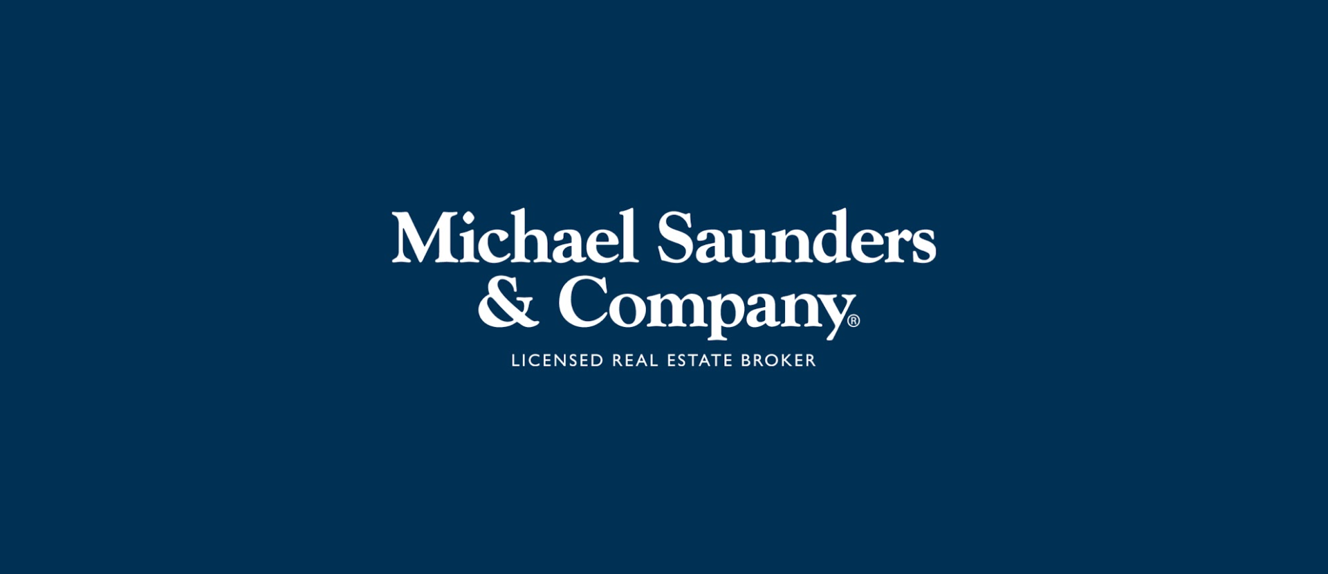
The logo of Michael Saunders & Company is a wordmark, written in a smaller but bolded font.
This shows professionalism but also instills more trust in the brand. For everyone not familiar with it, there’s a smaller text below showing that this is a licensed real estate broker. The logo is similar to many others in the industry, but still incorporates subtle, unique features that make it special and memorable.
7. Realty ONE Group
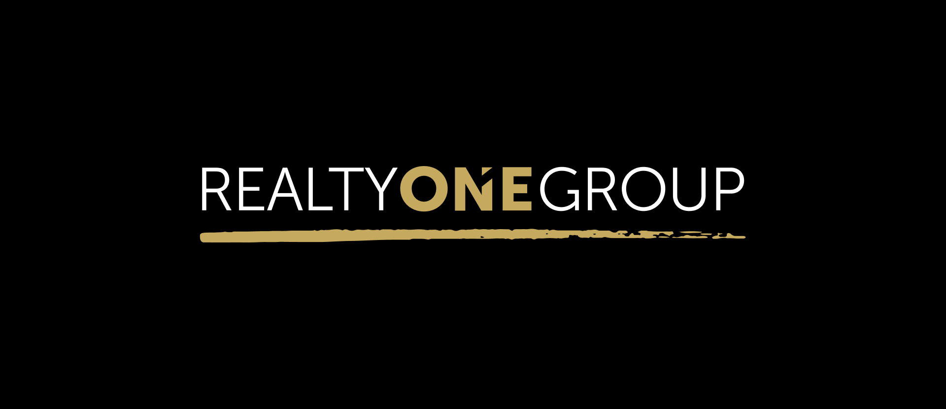
Realty ONE Group has a unique, text-based logo for its ONE LUXE luxury division, where the division name is shown in oversized font, with a smaller one beneath for the whole group.
It’s a very unique logo, with the ONELUXE brand name written in golden letters that look almost 3D, adding a nice touch of luxury, which completely goes in line with the firm and what it offers. The name of the group is in white, but ONE is still written the same and in the signature gold color with shades, to show that the division and the group offer the same exclusive service.
8. Coldwell Banker Americana
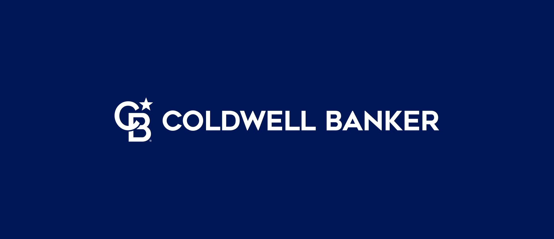
Coldwell Banker Americana has a text-based logo with the brand's name, but also uses the smaller version of the logo with the C and B letters and the ubiquitous star at the top.
The wording is simple, with a straightforward bolded font, evoking minimalism and quiet expertise. The signature blue color is there to portray professionalism and integrity. The star is the North Star, which has always signified guidance, consistency, and reliability.
9. The Beverly Hills Estates
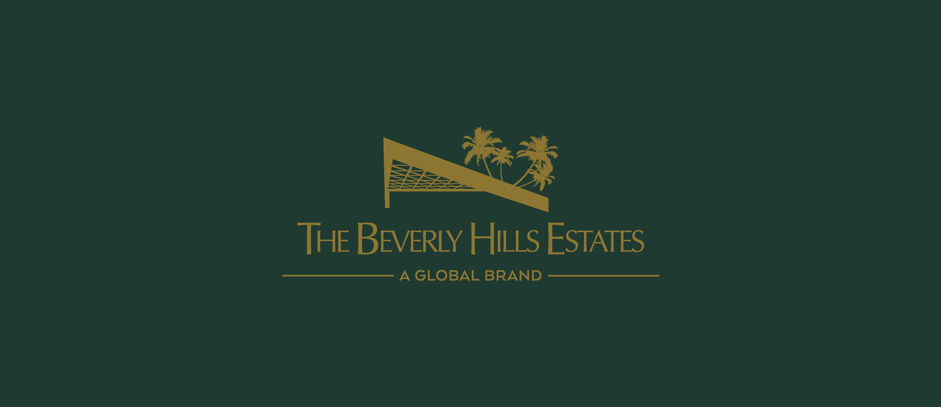
Influenced by the iconic Beverly Hills Hotel, the Beverly Hills Estates logo uses the unique drawing of the roof and palms, and text beneath.
All of it together is reminiscent of the hotel and its design, made in an effort to evoke a similar sense of luxury and exclusivity. It goes in line with the high-profile clientele the company tends to serve.
10. William Pitt Julia B. Fee
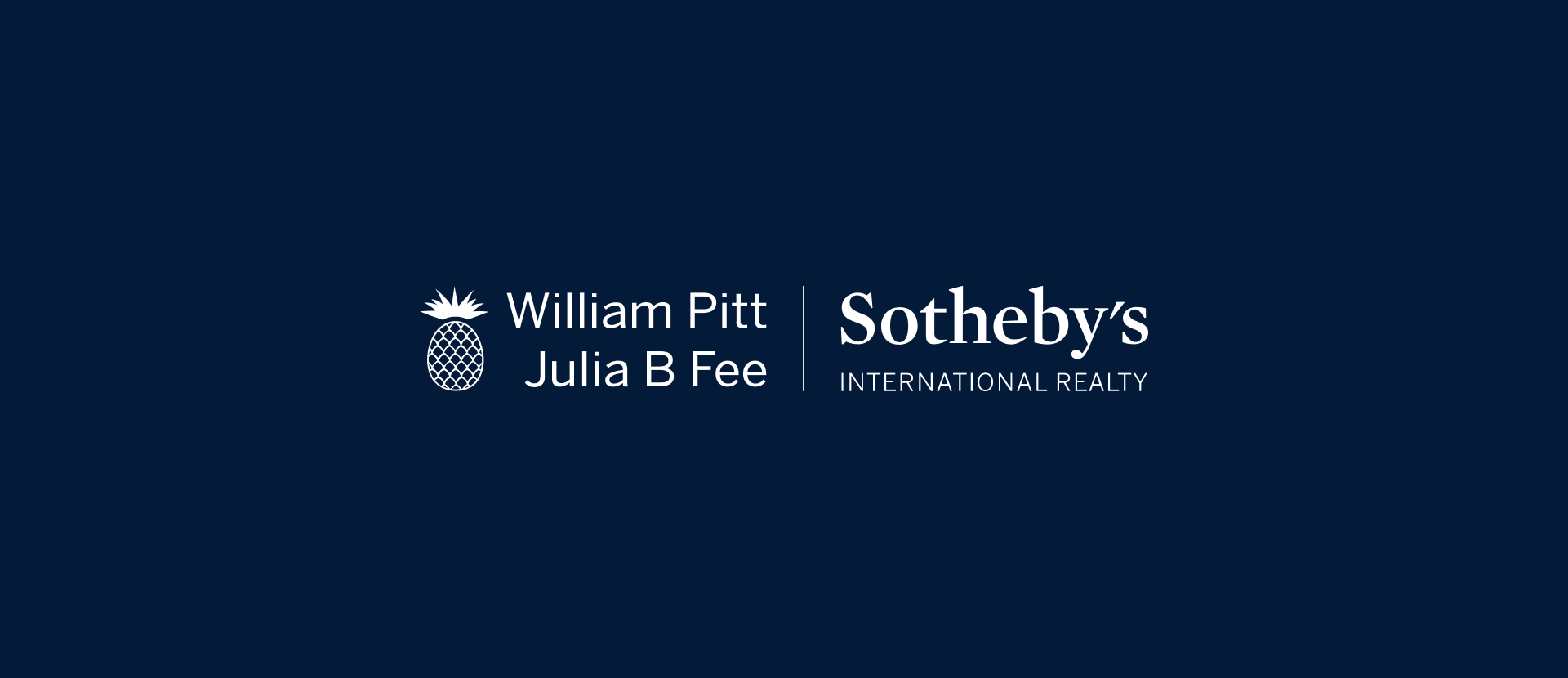
The William Pitt Julia B. Fee Sotheby’s International Realty logo contains the exact wording of the brand and the larger company it’s a part of, together with a drawing of a pineapple.
The pineapple is the mark of the Sotheby’s International Realty auction house, which is behind this real estate brokerage. The full names of both companies are there to show the connection between them and the importance of this partnership for both brands.
11. A and N mortgage
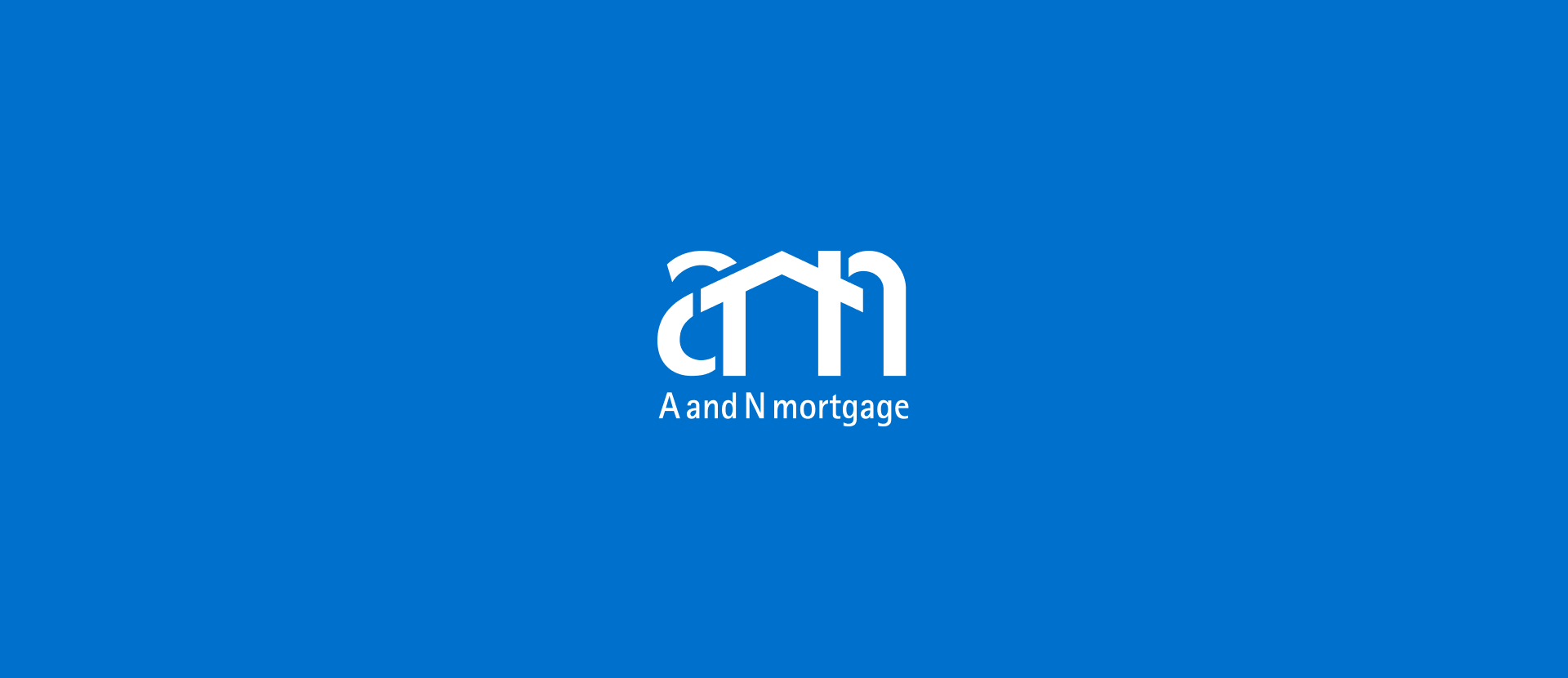
The A and N Mortgage logo is an interesting drawing of the A and N letters in the name and a symbol of a house connecting the two, with the name of the company beneath.
The design of the logo symbolizes stability and trust, while the underlying blue color is there to evoke professionalism and reliability of the financial aspect of the company. The calming effect of the color and house symbol is effectively conveyed in an effort to make the whole mortgage process less frightening.
12. RG Realty Group
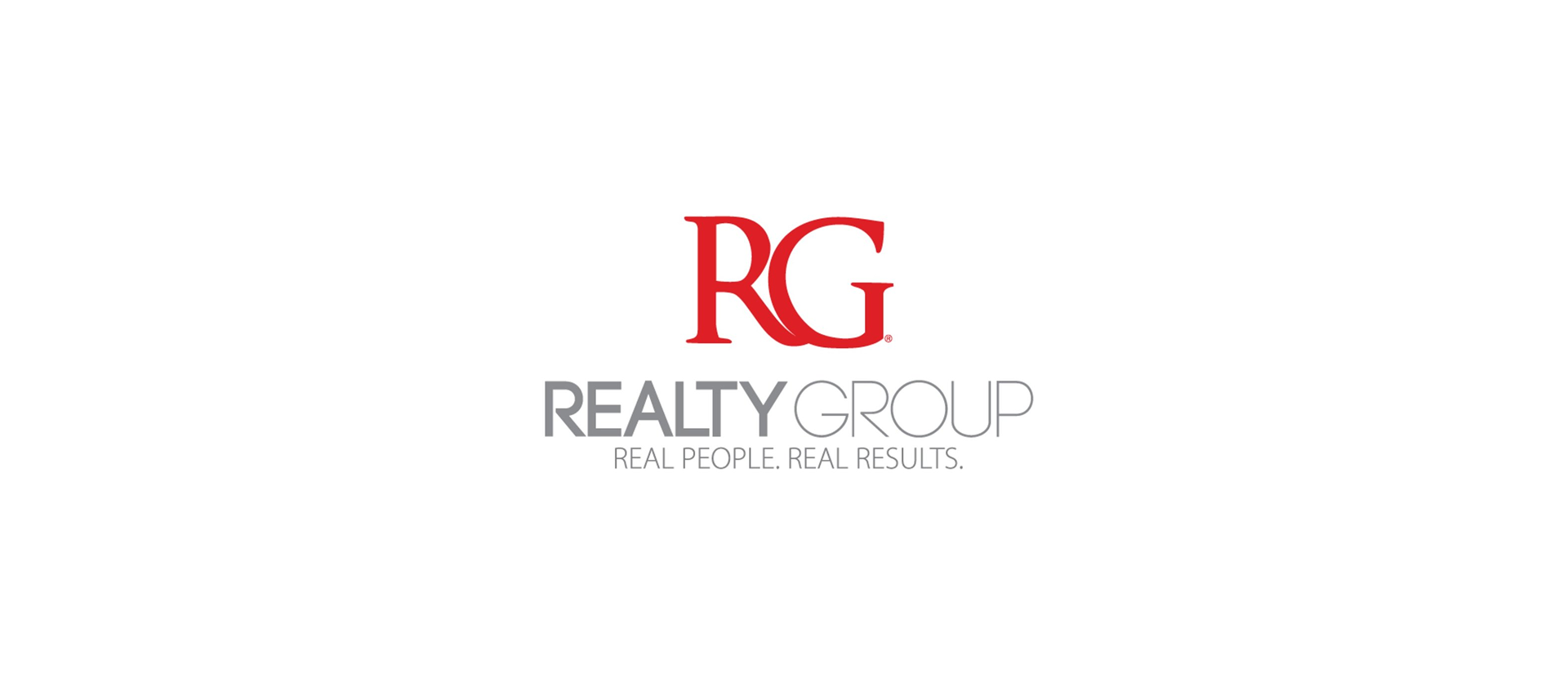
RG Realty Group has a logo with the name of the company where each word is designed differently and using different colors.
The most prominent is the RG part in bolded, large, and red letters that convey strength and expertise. The whole logo is very professional and strongly conveys the quality of the brand’s services.
13. Orion Lending
Orion Lending has a large logo with the name of the company, with the Orion part more prominent and embellished with stronger colors and a ring around the O.
The ring makes it look like Saturn or another planet with rings, but it’s actually connected to the name of the company, as that’s also the name of the well-known constellation.
14. Homestead
The logo of Homestead Funding Corp. is effectively a wordmark with a rounded symbol of a house instead of the O letter in Homestead.
The word Homestead is the most prominent, and together with the house symbol, it’s made to portray security, stability, and a sense of home.
15. E Mortgage Capital
Like most others in the real estate business, the logo of E Mortgage Capital is a wordmark, with the first part of the brand’s name emphasized. However, next to the name is the central part of the logo, i.e. a cube made of the first three letters of the name.
The E Mortgage part is bolded and bigger to bring the viewer's attention to it as it effectively describes the main service the brand offers.
16. Amerifirst
The logo of Amerifirst is the name of the company, but is designed in a way to reflect the US flag. You can see a visualization of a part of a flag to the left, while the main part of the name, Amerifirst, uses an interesting font and design that further evokes the flag. On top of that, a star is integrated into the A as well as instead of the dot in the second I letter.
This is all done to demonstrate the company’s patriotism and ensure viewers know Amerifirst is trustworthy and reliable.
17. Modish Marketing

The logo of Modish Marketing Studio is a wordmark together with a stylized signature that’s connected to the brand.
The signature and the Modish part of the name are accentuated, with 'Modish' bolded, to establish the brand’s image in the viewer's eyes.
18. Sync Brokerage

Sync brokerage has a unique logo where the Sync part of the brand’s name is in oversized letters, together with two-thirds of a circle that covers the second half of the word.
The brand’s name in the logo uses a clean and modern sans-serif font with all the letters lowercase. The sync part is fully highlighted to bring attention to the brand, not just the services it offers.
19. Tristan
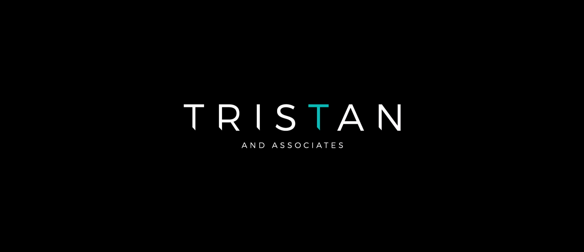
The logo of the Tristan and Associates brand is a wordmark, with the Tristan part in large and bolded letters.
The And Associates part is barely seen as the accent is on Tristan, where the second T is in a light blue color, which also acts as a separate logo of the firm. Tristan is the founder of the real estate firm, and the brand is associated with him, which is why the emphasis is on that part of the logo’s wordmark.
20. Thrive Mortgage
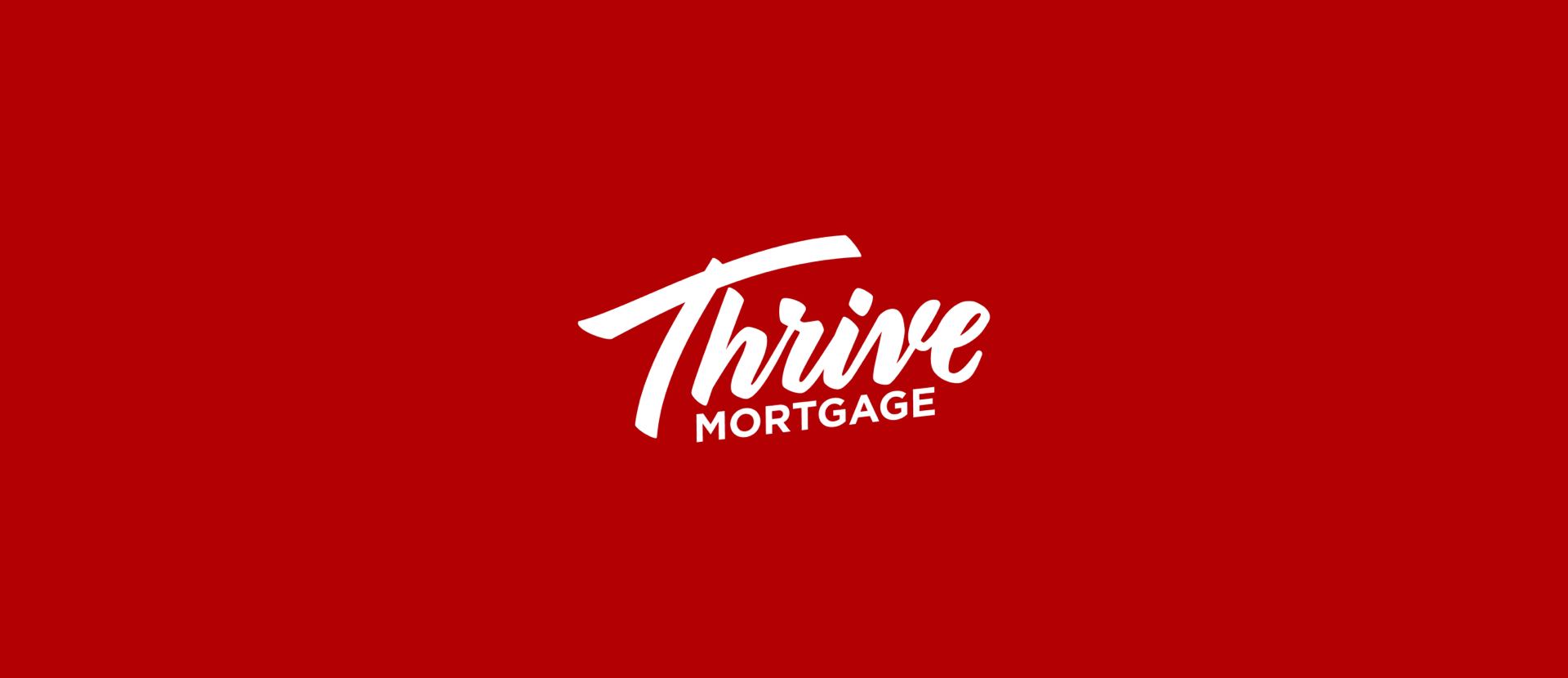
The word Thrive is the central part of the logo of Thrive Mortgage, made in bold, red, and highly stylized font, while Mortgage is in a standard font to ensure professionalism and clearly show what the brand’s services are.
The logo is tilted upwards to the right, to demonstrate the constant growth and advancement of the company. Overall, the logo is very modern and friendly, to show people that they can trust Thrive Mortgage.
21. Higgins Group
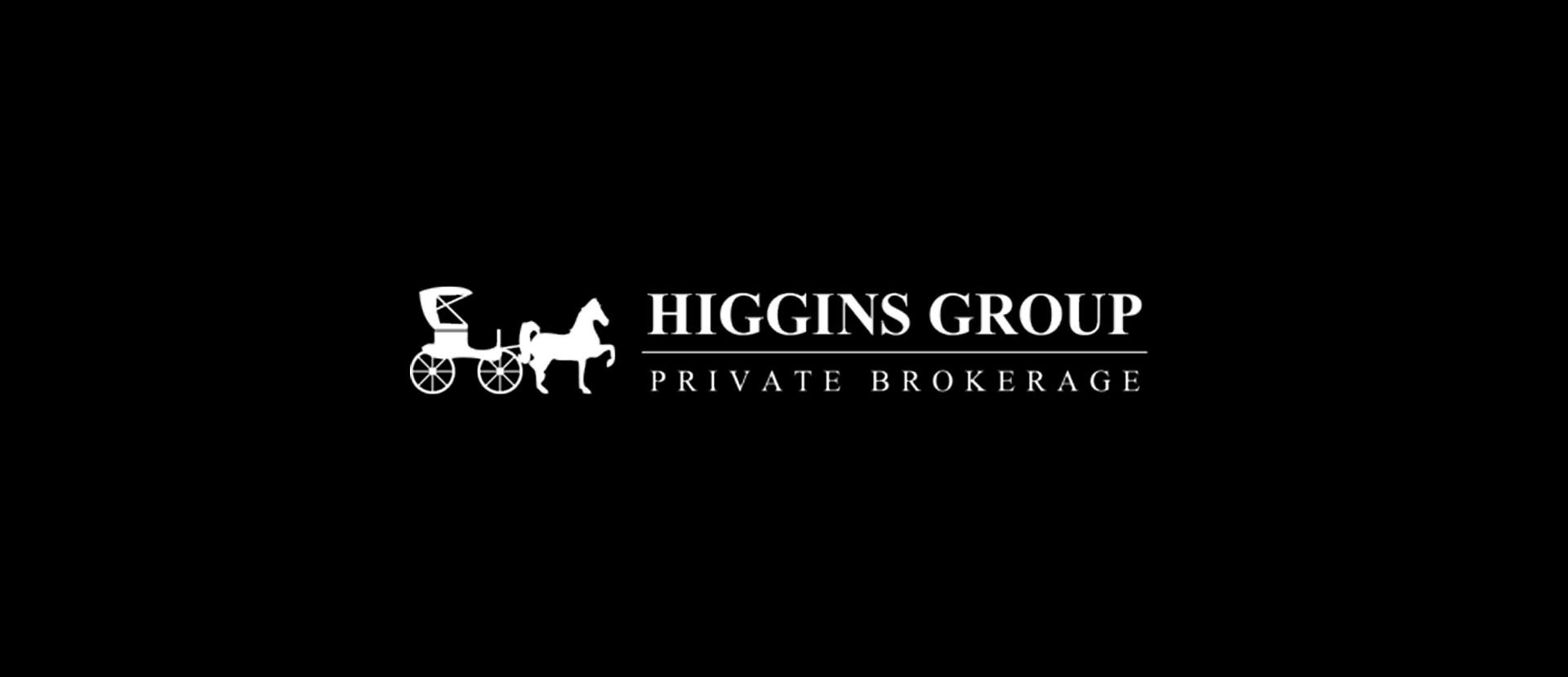
The Higgins Group logo is a white drawing of a horse carriage and the name of the company.
The whole logo is either white or black and is designed in a highly professional style with a standard font to evoke the brand’s corporate nature. Beneath the company’s name is the phrase Private Brokerage, which ensures every new viewer and potential client knows what the services of the company are.
22. Neo Home Loans
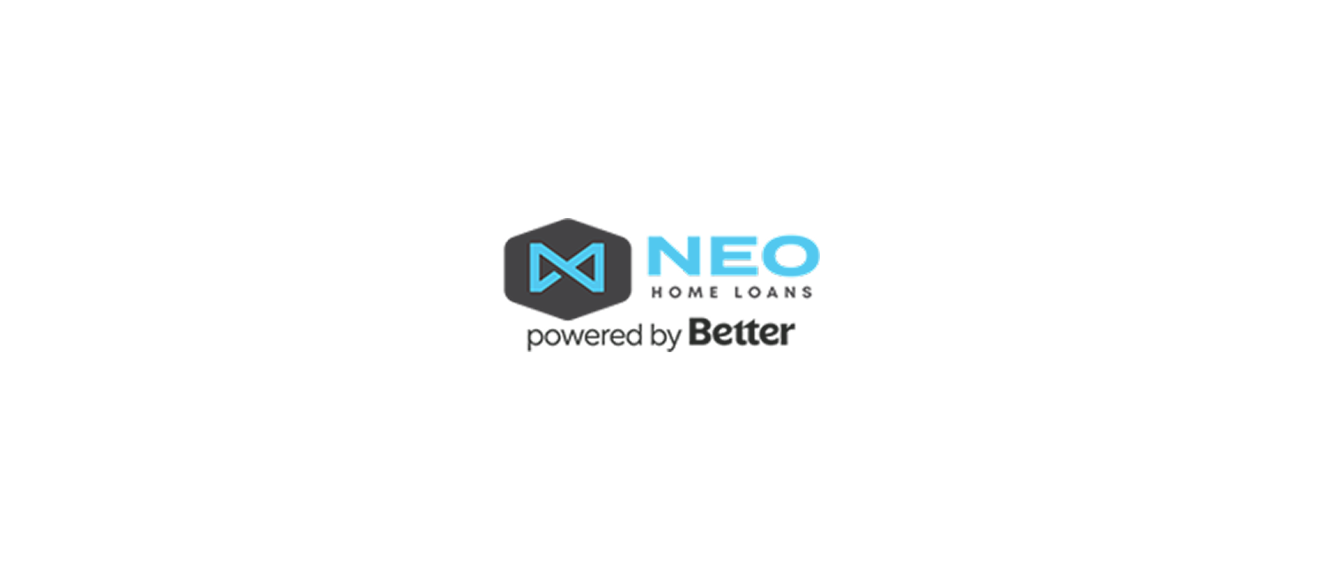
The Neo Home Loans logo uses the brand's name and a graphic element that symbolizes guidance and progress.
The symbol is there to show that the company aims to guide and assist its clients. It’s the most prominent part of the logo, together with Neo, which is the actual brand’s name.
Bottom Line
We hope that our selection of the best real estate logos will inspire you and show you what kind of decisions you should make for your own logo.
If you like how they look and you’re behind a brokerage interested in robust design and marketing software or just assistance with logo design, feel free to book a demo with us to see how we can help.
.png)


